A cornice, in architectural terms, is the moulding that crowns the top of a wall or accents a special feature. Cornices occur on the exterior of a building facade as well as at the tops of columns. They also occur on the interior, providing decorative trim around the room. Determining what colour to paint cornices can be a challenge, but the following strategies will prove helpful.
Exterior cornices
Some historical buildings such as flat-fronted town houses have beautiful, decorative cornices that crown the building. You might choose a paint colour to accentuate the cornice. If the building is a light colour, paint the cornice black or dark brown for contrast. If there is already an accent colour on the facade of the building, such as dark green shutters, continue this colour scheme by painting the cornice the same colour. Other cornice designs are more minimal, and perhaps you'd prefer if it blends with the rest of the building facade. In that case, paint the cornice the same colour as the rest of the building, or a slightly darker tone to provide depth.
- Some historical buildings such as flat-fronted town houses have beautiful, decorative cornices that crown the building.
- If there is already an accent colour on the facade of the building, such as dark green shutters, continue this colour scheme by painting the cornice the same colour.
Bold cornice colours
If you own a historic home, especially of the Victorian era, don't shy away from using bright colours. Research historical colour schemes that might have originally been used in homes from the same time period. An examples is mint green walls with dark green cornices. Especially in smaller spaces, you can make a bold statement with reds, blues or golds. These colours highlight ornate cornices and mouldings and unify the room.
- If you own a historic home, especially of the Victorian era, don't shy away from using bright colours.
- Especially in smaller spaces, you can make a bold statement with reds, blues or golds.
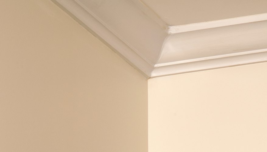
Painting cornices: a minimal effect
For modern homes or at least those with more minimal moulding, the paint scheme should be more subtle. The most common paint colour choice for cornices is semi-gloss white. Avoid using a stark white, but carefully study the tint of the paint: every white has a hint of some colour. Coordinate it with your wall colour and the colour scheme of the room. Just as with exterior cornices, a successful and subtle paint treatment for interior cornices is a shade or two darker than the wall colour itself. For example, if the wall colour is a light, sandy beige, choose a mid-tone taupe for the cornice and other trim.
- For modern homes or at least those with more minimal moulding, the paint scheme should be more subtle.
- Just as with exterior cornices, a successful and subtle paint treatment for interior cornices is a shade or two darker than the wall colour itself.
Other considerations
Cornice colour should be carefully coordinated with all other colours that will be applied to the wall surface. Compare paint swatches and purchase a sample of the colours you intend to use. Paint a small section of the wall next to the cornice, and test out your cornice colour as well. This will give you an idea of what the room -- or building exterior -- will look like after it is painted entirely. Typically, the cornice colour is also used on the rest of the trim in the room including baseboards, wainscoting and window trim. On the exterior of a building, the cornice colour often matches window trims or shutters, or sometimes the front door. A cornice not only caps a wall but unifies a room or exterior composition, so choose your cornice paint colour carefully.
- Cornice colour should be carefully coordinated with all other colours that will be applied to the wall surface.
- Typically, the cornice colour is also used on the rest of the trim in the room including baseboards, wainscoting and window trim.