Red is a cheerful and warming addition to home decorating schemes. It is easy to use in small amounts in pillows, small decorative objects, and throw rugs to add a touch of colour. However, a large red expanse such as carpeting presents some unique challenges. Selecting the right shade of wall paint can mellow that red floor without detracting from its starring role in the decor.
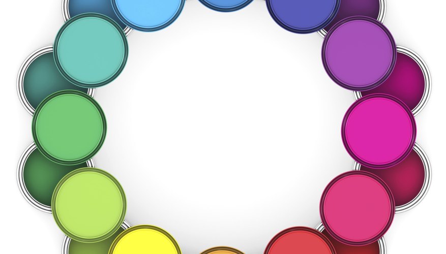
Consult the colour wheel and locate red, one of the primary colours; the other two are blue and yellow. Mixing the primary colours results in the secondary colours of purple (red plus blue), orange (red plus yellow), and green (blue plus yellow.) Notice that green lies directly opposite red on the colour wheel; green is the complementary colour of red. The colours on either side of red are orange-red and purple-red. Those on either side of green are yellow-green and blue-green. These are known as tertiary colours.
- Red is a cheerful and warming addition to home decorating schemes.
- Consult the colour wheel and locate red, one of the primary colours; the other two are blue and yellow.
Decide if you want to make your room look smaller or larger. Red is a warm colour like yellow and orange. Warm colours tend to make a room look smaller and more inviting. The cool colours of blue, green, and purple make a room look larger and more restful. The warm colours stand out, or advance, to the human eye. Cool colours recede.
Consider carefully using red's complementary colour, green. A deep-red carpet can be used successfully with a lighter shade of green or its relatives, blue-green and yellow-green. Opting for blue-green or yellow-green is an example of a split-complementary colour scheme, very attractive in many rooms. However, a shade of green that is of the same intensity as the red carpeting presents sensory overload; the colours will clash.
- Decide if you want to make your room look smaller or larger.
- Opting for blue-green or yellow-green is an example of a split-complementary colour scheme, very attractive in many rooms.
Assemble a number of paint chips and wallpaper samples of various shades of green, blue-green, and yellow-green. Make sure the wallpaper samples are large enough to present an idea of how the pattern would coordinate with the carpeting. After selecting a few likely shades of paint chips, go back to the paint department or shop and purchase small cans of each shade. Paint pieces of plasterboard with each colour, and prop these samples against the wall. Take a few steps back and compare the results. It will be apparent which shades work with your carpeting and which do not.
- Assemble a number of paint chips and wallpaper samples of various shades of green, blue-green, and yellow-green.
- Make sure the wallpaper samples are large enough to present an idea of how the pattern would coordinate with the carpeting.
Collect throw pillows, pictures and other wall decor, throw rugs, and similar items, and spread them out on your carpeting beside the piece of painted plasterboard you selected for your paint colour. Observe how they work with your chosen colours. Some items will be rejected in short order. Others will beg to be included in the new colour scheme. Keep your colour wheel handy while you do this.